Buying Guide
How to Choose the Right Painting
Size, color, and room-by-room advice for original art buyers.
Getting the Size Right
The most common mistake in buying original art is getting the size wrong. A piece that’s too small reads as an afterthought. A piece that’s too large overwhelms the room. Here’s how to get it right, room by room.
- Above a sofa or console: The painting should be roughly two-thirds the width of the furniture below it. For a 90-inch sofa, aim for a piece around 60 inches wide — which is exactly the width of Lei-Kol’s 48x60 inch statement pieces.
- Above a bed (queen or king): Width should match the bed width — 60 inches for a queen, 76 for a king. A 48x60 horizontal piece works beautifully above a queen.
- Entryway or foyer: Go bigger than you think. A 24x36 piece on a 12-foot wall reads small. For double-height entries, a 48x60 vertical makes the wall feel intentional.
- Office (behind a desk): 48 inches wide minimum. The piece should fill the wall behind you — it’s your video-call backdrop and your daily view.
- Dining room: Mid-scale works well — 30x40 to 30x48 inches above a buffet or sideboard. Hang lower than in a living room (54-56 inches centerline) since people are seated.
Choosing the Right Colors
Color is personal, but a few principles will save you from buyer’s remorse.
- Match the value, not the hue. If your room is light and airy (white walls, natural light), most colors will work. If your room is dark (charcoal walls, low light), pick a piece with contrast — Bipolar (black/white) or Stardust (dark with metallic highlights) reads beautifully against dark walls.
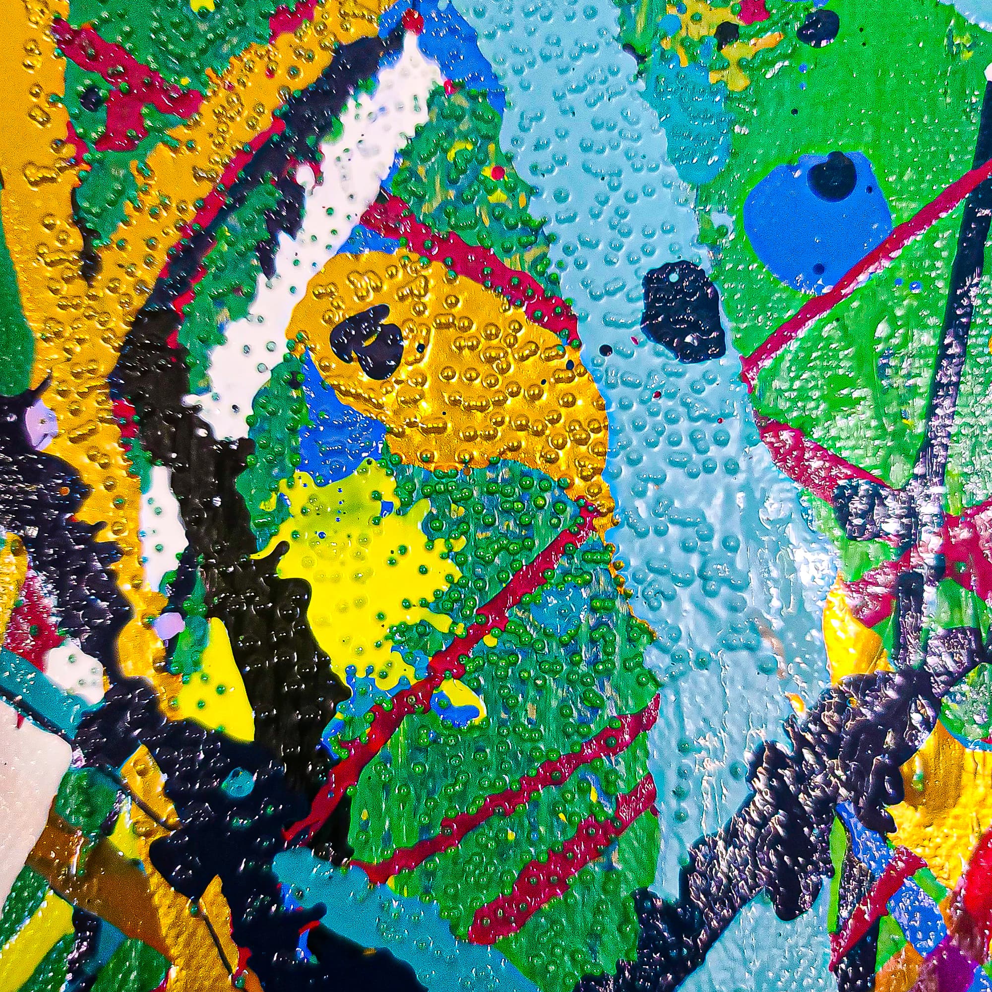
- Let the art lead. If you have a neutral room, a bold piece (Maui, Dominion, Blood Moon) becomes the focal point. If your room already has strong color (a bright rug, accent chairs), lean calmer (Gray Day, Waterfalls, Blue Denim).
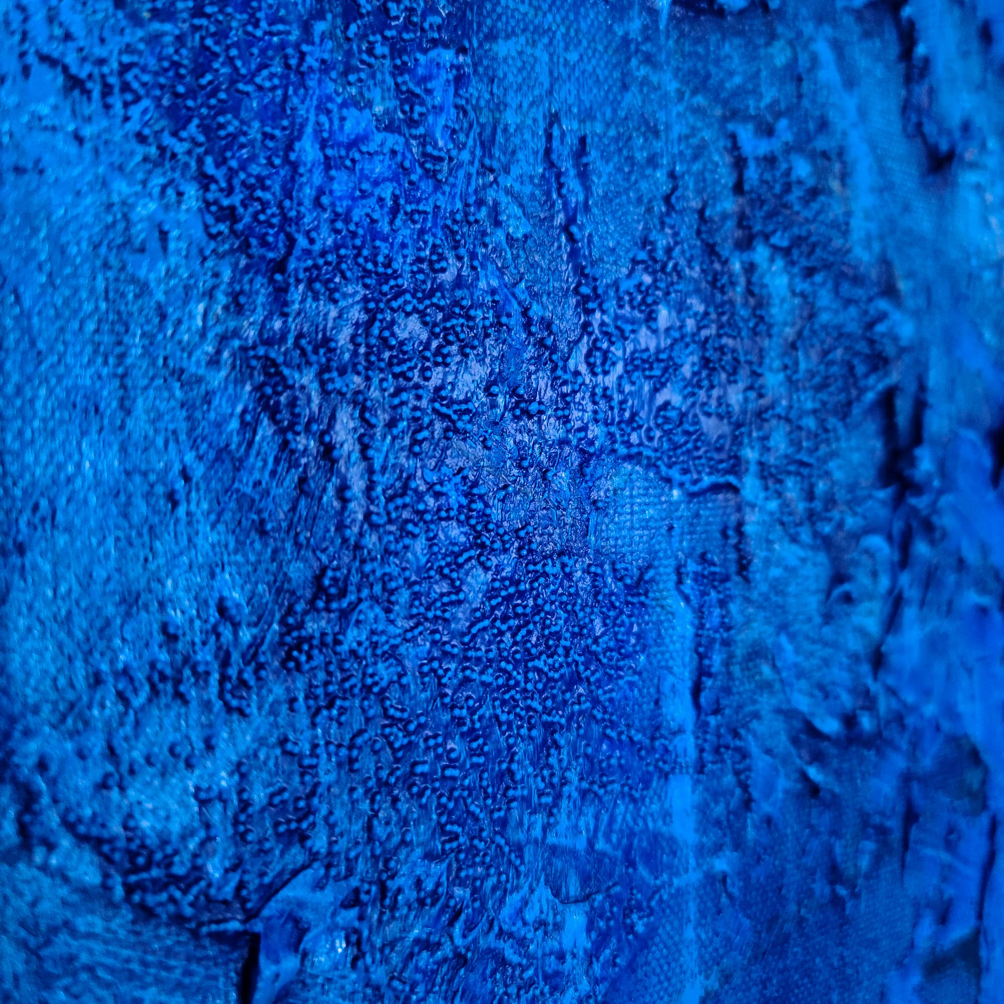
- Blue is the safest bet. Blue paintings (Blue Denim, Riptide, Waterfalls) pair with almost any wall color and read as calm and sophisticated in any room.
- Warm tones for social rooms. Gold, amber, and red tones (Maui, Dominion, Blood Moon) energize living rooms and dining rooms. Cool tones (Gray Day, Waterfalls) calm bedrooms and offices.
- Consider your lighting. Colors shift under different light. Warm bulbs warm up cool colors. Daylight cools down warm colors. If possible, look at the piece under the lighting it’ll live in — or ask for photos in different light.
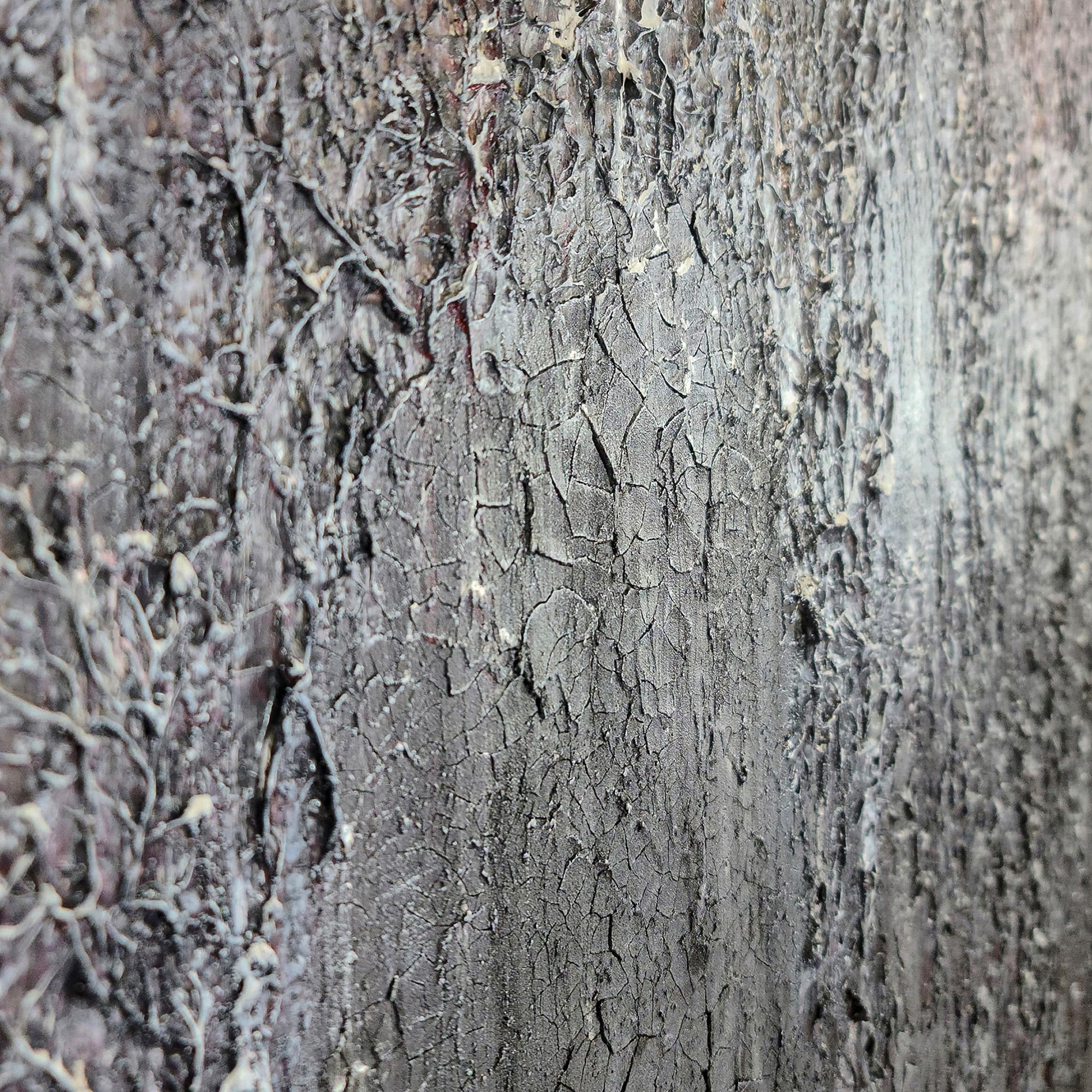
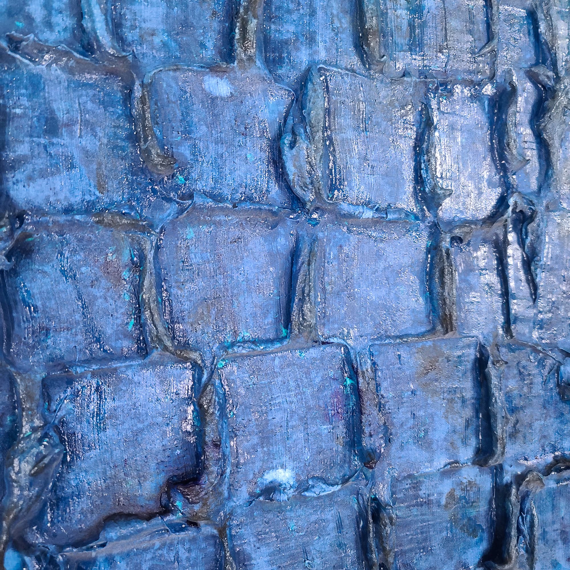
Texture Makes a Difference
Lei-Kol’s heavy-texture pieces behave differently from flat paintings. The surface catches light and casts shadow, which means the piece changes as the light in the room changes throughout the day. This is a feature, not a bug — but it’s worth knowing.
Textured pieces read best under directional light — track lighting, wall sconces, or windows that cast light across the wall. Flat, diffused overhead light will still show the color beautifully, but the dimension is most dramatic with side-lighting.
Still Unsure?
Take the AI art-match quiz. Answer six quick questions about your room, palette, and vibe — and the DeepSeek-powered assistant will recommend the pieces that fit.
Take the Art-Match Quiz →Frequently Asked Questions
How do I know if a painting is the right size for my wall?+
Use painter’s tape to outline the painting dimensions on your wall. Live with the outline for a day. Step back and look from every angle. The right size fills most of the wall without crowding it.
What if I order a piece and it doesn’t look right?+
We offer a 14-day return window. If the piece isn’t what you expected, reach out and we’ll arrange a return and full refund. No restocking fees.
Should I match the art to my furniture?+
No — let the art lead. Match the overall mood (calm, bold, warm, cool) rather than specific furniture colors. A painting that complements without matching creates a more sophisticated room.