Art for the
Bedroom
Calm, textured originals for primary bedrooms, guest rooms, and retreats.
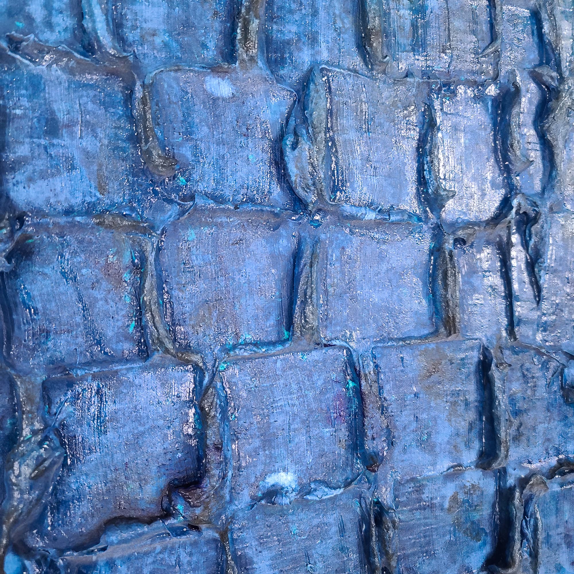
Browse Paintings →The bedroom is the room that should feel quiet. Lei-Kol's tonal pieces — gray, blue, soft white — were designed for that mood. Heavy texture without aggressive color reads as sculpture more than statement, which is exactly what a bedroom needs.
What to Look For
- ◆Match the value (lightness) of the piece to the bedding, not the wall
- ◆Centerline at 6–9 inches above the headboard for an above-bed piece
- ◆Width should be roughly the width of the bed (60" for queen, 76" for king)
- ◆Calmer palettes sleep better — Gray Day, Waterfalls, Blue Denim, Riptide
Avoid anything too red or too high-contrast above the bed — color theory aside, you'll feel it. Save Maui and Bipolar for the living room.


Frequently Asked Questions
What colors work best in a bedroom?+
Cool, calm tones like blue, gray, and soft white create a restful atmosphere. Waterfalls, Riptide, Blue Denim, and Gray Day are ideal bedroom choices.
Where should I hang art in a bedroom?+
Above the headboard is classic — 6–9 inches above it. Centerline at 57 inches. Alternatively, opposite the bed so it’s the first thing you see waking up.
Can textured art work in a small bedroom?+
Yes — the texture adds depth without taking up floor space. A mid-scale piece like Waterfalls (36×24) or Riptide (24×48) anchors a wall without overwhelming the room.
Shopping for Another Room?
Explore by room